CONTACT
Custom Lane,
1 Customs Wharf,
Edinburgh,
EH6 6AL, United Kingdom
mail@aefoundation.co.uk
DIRECTORS
Nicky Thomson
FOUNDING DIRECTORS
The AE Foundation was established in 2011 to provide an informed forum for an international community of practitioners, educators, students and graduates to discuss current themes in architecture and architectural education.
![]()
OLIVER LÜTJENS
THOMAS PADMANABHAN
︎︎︎Samuel Penn
HOUSES
SP
Oliver and Thomas are going to presentation their work and also the methods and processes they use in practice and in teaching. Over to you Thomas.
TP
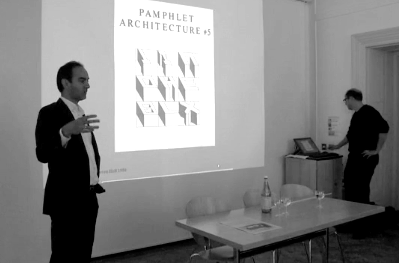
We love the city, we love streets, we love squares, façades, we love rich and complex interiors, but paradoxically whenever we build or design a project we almost always end up in places that are neither urban or rural, but an undifferentiated fragmented in-between. This dilemma is central to our work. In 1980 the architect Steven Holl published a small pamphlet titled The Alphabetical City. In this pamphlet he assembled a beautiful collection of apartment building plans from the cities of Chicago and New York and he isolated them in this pamphlet from their context, and yet when we looked at the pamphlet we were stunned by the qualities of these plans. We were surprised that while these plans were taken out of their context they still retained very strong urban qualities as urban buildings. The first project that we’re going to show is a competition in Geneva. It was for three hundred units of low-income housing on the outskirts of Geneva. The site is in an old Siedlung with the repetition of a house, a green space, a house, and so on. The client wanted to tear the Siedlung down to get triple the amount of units on the site. When we entered the competition we knew that the client wanted to have exactly the same plan as the existing, but we wanted something urban.
Our plan is T shaped. It’s a building that has a façade toward the street. It has a division in the façade, a very high base, big windows toward the street space and one central entrance. When you go through the common entrance hall you end up in an arcade that connects to the back of the garden. Along this arcade are the staircases that lead up into the apartments. The building has a face back to the graveyard. The urban problem was how to build large urban buildings that have a connection to the street, that have a public face, in a structure that is very heterogeneous, that is very mixed, where there’s no apparent rule of how the fabric of the city could continue. We intended these three T’s to form a moment of urbanity in an otherwise very blurry context, a possibility to continue to build the city but without establishing a rule that needed to be followed in the future.
![]()
fig. 1
La Fontenette model
Carouge 2008
The apartment plans are very efficient. It’s the lowest level of social housing that we do in Switzerland, so it has to be tight. It’s a structural plan, so every wall carries the building. The apartments have a very clear room to room to room sequence and the staircase is also one of those rooms. Then right after completing this housing competition we received a commission for a house. The clients were businessmen who worked together in a big corporation in Zürich and had seen a piece of land in Rüschlikon on the lake of Zürich that they really liked. It’s quite a privileged site, which they had to bid for it, and they asked us if we could build a house for two families because they couldn’t afford it individually. We said: “Yes it’s possible.” And within one week we made a design. After five days what we had was a volumetric study from which they could decide what side of the house they wanted to live in, which family would look in which direction, and who would claim which part of the garden. What we had at that time was not a design for a building, but a volume that was mostly an expression of the building laws, and now the main work was to turn a volume into a building. We found two buildings to help us: the Müller House by Adolf Loos and the Vanna Venturi House by Robert Venturi.
TP
The volume that the building laws created looked a bit like Villa Müller, but even though we really loved this building, we realised that we couldn’t make it as heavy and muscular as the Müller House. Robert Venturi showed us how you can make a building that refers to the full history of architecture using a modest palate, and in a very thin and delicate way. The problem was really the question of scale. The piece of land was so expensive and so small that you could barely fit a semi-detached house on it. It was important to give it an expression that would at the same time make it monumental and delicate. We spent a long time on the façades. Because the building volume was so difficult and so complicated, we only looked at the façades in planar. Each façade was executed separately. All of the façades have a primary central axis, and balancing elements that you can see most clearly in the main façade.
![]()
fig. 2
Semi-detached house model
Rüschlikon 2008
It’s first and foremost a classical composition. You have a base, a Piano Nobile with a three-axis composition, but then the second house at the back of the building totally imbalances this classical composition. We needed modern elements to counterbalance this and added a patch of stone and a bay window that tilts out of the main facade, and through these elements we think we achieved a composition as a Gesamt-Gestalt (complete form). It took a long time to find the right solution. It looks simple, these three rows of windows and then this bay, but when we looked at it, it always looked old in bad way, it looked stale, so we had to create things to transform it, and this folding out was the key. The back façade was much simpler and easier. It has similar elements as the front but for instance the windows that go around the building are ten centimetres narrower on the front. It makes the front façade a bit more elegant and the back façade a bit more relaxed. Because the house is on a slope the Piano Nobile is high with the other house with the view, but on the other side the house is actually in the garden. But the difficulty with the plan was that it was only seventy-five square meters per house, so it was just like a modest row house, so by moving the two staircases into each other we generate zones that are narrower and others that are wider and make it less like one room.
OL
This is the room and we added this pattern on the floor, which is actually like a floor of a much bigger building, of a much bigger room, and wherever you stand in this room you never see the end of this floor.
![]()
fig. 3
Semi-detached house staircase
Rüschlikon 2008
Photograph by Walter Mair
When you come down the stair there’s this pattern that suggests that you can stand on it, it has a certain presence and heaviness, but then when you stand on it you just feel that it continues but you don’t know where it continues to. While you work on a project you can make it richer and richer. You don’t need to know everything from the start, and if a client allows you to do certain things and doesn’t allow you to do other things, then you should always be flexible in exploring ideas in the areas where you can. The site was expensive and the building structure was also expensive because it’s built in a hill, so the façades had to be really cheap and thin. And so the cheapest way to build in Switzerland is with a layer of outer insulation, you have a loadbearing wall made of brick and then you put an outer insulation on it and then stucco, and we kind of embraced that. We were always taught that construction was really important, everything had to be real, and so it was very refreshing to be totally fake about everything. It’s a foam building, and the area of stone is just two centimetres thick and glued on to the insulation. But it’s important because it provides this point of gravity and also marks the entrance that’s on the side. But on the side you see the two-centimetre edge of the stone. You also see that the window sills are very thin but they project as far as we could make them, like long fingernails, they give these openings a real delicacy. Then railings and two colour anodised window frames, with a silver line in the middle and then the actual window frames are black like mascara around the eyes. The frieze around the building that we needed in terms of proportion also binds together the rather messy pavilions on top of the roof. While we always designed these façades in planar we in the end still enjoyed the very volumetric sides that the building has as well.
TP
The next project is in the outskirts of Basel where the main inspiration was the Palazzo di Carlo Borromeo by Pirro Ligorio, a Renaissance palazzo on the edge of Rome.
![]()
fig. 4
Palazzo di Carlo Borromeo, Pirro Ligorio
Rome 1555
We were fascinated by the idea of having a central element that creates a kind of cross motif with a cornice that separates the building into two portions, one upper and one lower portion, and that you would be able to create with such simple means an extremely expressive Gestalt for the building. It’s a building with three apartments in a suburban area surrounded by family houses that are now increasingly being replaced by small apartment buildings. The problem with this design was how you could give a small apartment building with two levels an expression of the collective character, because in a two-storey building there is no repetition; there isn’t enough repetition to create a grand or anonymous kind of impression. What we decided to do was to differentiate between the upper level and the lower level of the building, even though the apartments inside are very similar, using a window motif on the upper level that creates the impression of a piano nobile, the classical idea of having the main floor on the first floor, and to bind, almost suspend the lower floor from this upper floor.
![]()
fig. 5
Binningen 1 model
Basel 2011
It’s a very small building. We used to call it a mixture between OMA’s Dutch House and a Palladio villa. Every façade was completely individually. There’s one apartment per floor. With this plan we made a discovery. With a very small apartment, a kitchen dining living area, one bedroom with a bathroom, a workspace, plus the loggia, which is an outdoor space, we felt that we needed to open it up without losing the different private zones in the apartment. So we introduced a central pillar.
![]()
fig. 6
Binningen 1 plan
Basel 2011
It does two things; it separates the dining area from the living area, and also from the workspace and it creates a central axis around which all the spaces rotate. We got the building permit. It took the authorities less than six weeks. Five days later we received a letter from the municipality saying: “we’re terribly sorry, five years ago, when we digitised it, we put the wrong colour on the zoning plan.” The client called us and asked what was going on: “is this good news or bad news?” And we told him it’s good news because we could build more. Everyone was happy. But we were disappointed because we really liked the original design, and it took us a very long time to figure out how to make a much bigger building on the same site that was already small.
OL
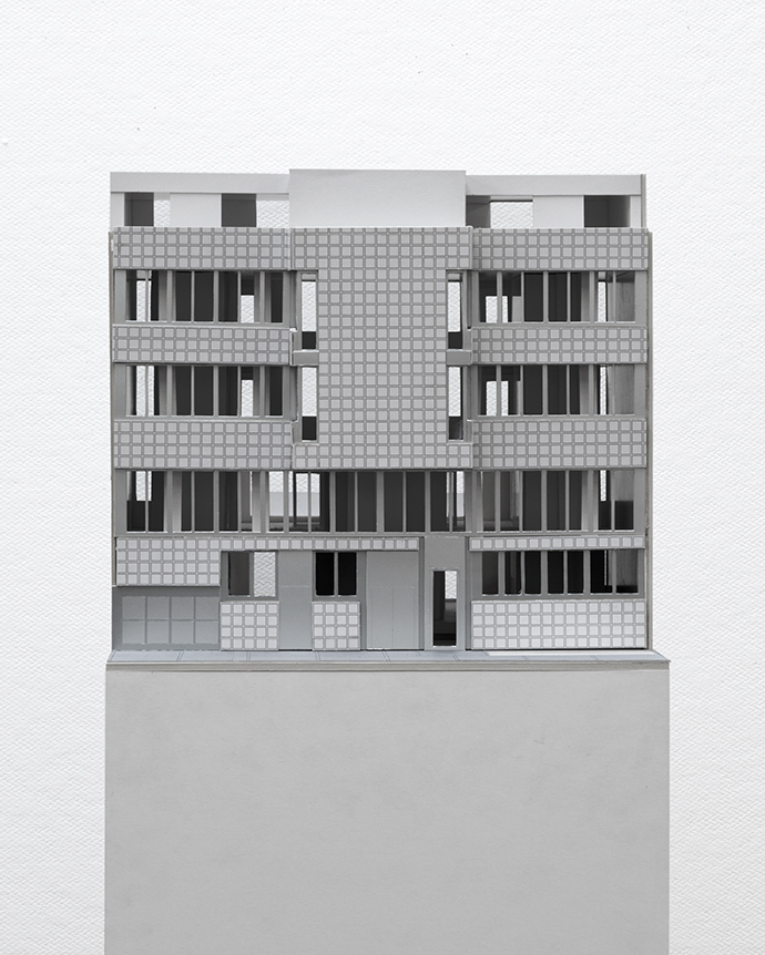
The new project is similar to the first. It has a façade facing the street, it has a façade toward the garden but the garden became rather small, the parking garage had to move to the side, so the building almost occupies the whole site. But when you start to develop the façades you realise that when you move from a three unit to a five unit building, when the size and the volume increases, you suddenly have to apply different orders, different rules to achieve an expression for the building. This became so clear because we had to do the same project in different sizes. But we also copied the old elements. What used to be the main façade for the garden moved to the street and the motif multiplied. Whereas on the other façade it’s still about this cross balance thing, which makes a centre, this motif of a big window with a small window hanging below it moved around the whole building and the cornice became the most important line in the project with the figural windows hanging from it. Like the first project, the budget was not small but had its constraints, so again outer insulation and stucco, and the material we could also choose to use was metal. Everything other than the stucco façade was made of folded sheet metal. The coping, the frames around the windows that conceal the blinds on both levels, binds together the motif of the two windows, and also the pipes for the rainwater. So we like to think of the tectonics of the building, of how it’s put together as a kind of origami. Everything just got bigger. There are two apartments per floor. The idea of the pillar reappears in a different guise. Now the pillar has the purpose of unifying different spaces within the perimeter of the building. All the outside spaces, like the loggia and the winter gardens lie within the perimeter of the building, and these pillars allow for a second reading, they allow the inclusion of all the different spaces, inside and out, into the interior communal space of the building. Álvaro Siza says that good houses have ugly plans, and we are very proud of this ugly plan.
![]()
fig. 7
Binningen 2 plan
Basel 2011
The plan is composed of angular walls and columns that are rythmatised or ordered by windows that are all the same. It has a lot of interior windows and some object-like kitchens. We learned in architecture school that there’s a unity between interior structure of the building and its expression. That’s not really the case here, and we are very interested in exploring this fact. When we work on the apartments and when we work on the façade we have very different constraints that somehow relate to each other without ever really fitting. We also feel that the façade with its regular openings of course gives an order to the outside, but it also gives an order to the interior spaces.
TP
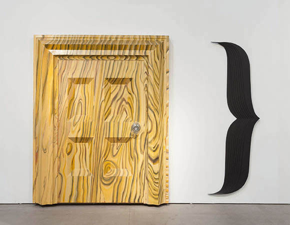
The Laurentian Library by Michelangelo in Florence is volumetric and it has force. But then you see how it’s built; you see the difference between architecture and construction. You see the columns, which are architecture; you see the niches, these plastic elements but with very thin dividing walls between the rooms. He put everything into making the architecture powerful to the limit of what was possible within his constraints. We want to talk about the relationship between construction and architectural form, to ask questions about honesty, truth, directness, or perhaps another relationship demonstrated by Michelangelo. The Laurentian also had an effect on how we thought about the interior spaces, the big living rooms of the apartments. In this space things are in order, there’s a repetition of sets but there are bays that are narrower, wider, things are breathing, they’re freely positioned and yet they are all autonomous. The pillars stand closely together but there is a gap between them, another gap between the window frame and the pillar and so on. At the same time we received a postcard of two art works by Richard Artschwager, an artist that died in 2012.
![]()
fig. 8
Richard Artschwager, Door } (1983-84)
C/O Kerstin Hiller, Helmut Schmelzer
Photograph by Annette Kradisch
He was somewhere between pop and conceptual art, but we really liked this strangely proportioned door with its oddly proportioned grain. We really enjoyed the clumsiness of the doors and tried to make our interior windows in a similarly comfortable way.
OL
The windows on the exterior and the windows on the interior have exactly the same width, always the same size, and between these we put plastic wooden elements, with gaps, so like in the Laurentian Library every element stands on its own. There’s a cat waiting in front of the building.
![]()
fig. 9
Binningen 2 entrance cat
Basel 2011
It’s a cat that once belonged to the American architect and educator John Hejduk. It’s the post-boxes, but also when you approach the building and ring the bell the cat listens to you, you have to speak into the cat’s ear, and he’ll speak back to you in the voice of the tenant or the owner. We like the idea of different scales. We are interested in relating the small scale to the big scale of the building. Here the plastic elements of the building are very clear with the canopy, the cat and the threshold all in this folded powder-coated metal.
TP
The next project is a competition we won for low-income social housing in Zürich. It’s a site near the Siedlung structures from the 1950s. There are single-family houses but also houses with flats. One of the buildings is being replaced. Between the buildings on either side of the site there’s a jump in scale, and the problem was how to design a building that wouldn’t destroy the spaces that are very characteristic of this neighbourhood. We decided, instead of designing a very simple volume, like a rectangle that would have an incredible volumetric presence and would dominate the surrounding, we would conceive a building that is like a series of independent walls that create a demarcation line around an area in which a plan of an apartment building is being inserted. So despite the angles, this building is not meant to be an expressive or aggressive building, quite the opposite, it defines certain outdoor spaces that are somehow already there because of the beautiful trees on the site. It sits in a context, which is like a garden city, and we wanted the building to sit on the street and to create the longest façade onto the street, so it hangs from the street façade and develops more freely in the garden space. The structure of the building is very rectilinear and the building form is as if you had a fence around a plot. We also like to think of it as if you were to cut out the shape of a building from a city map.
![]()
fig. 10
Waldmeisterweg plan
Zürich 2013
We felt that there were two different necessities in this project. One necessity was clearly the urbanistic, the form of the building in relation to the exterior spaces, and we were very sure about what we wanted in terms of the shape of the building, but at the same time we had to accommodate all the apartments that, because they were rather small, had to be very economical and therefore rectangular. There was an incredible pressure in our design process between the needs of the interior spaces and our stubbornness to keep the volume as perfect as possible in its urbanistic expression. The client was special. They wanted to provide relatively cheap apartments that could be occupied by a lot of people, something that would be flexible. Much of the new apartments designed and built in Zürich at the moment have big open living spaces where you dine and cook and have your TV and so on. Our client wanted all these to be separate, so we had to invent something new. You enter the apartment directly into a big hall where you eat and where there’s a kitchen, and from there you can enter a living room, which you can separate into a bedroom, and a big loggia connecting the two, and in the centre of the three spaces there is a column. It’s a bit rural; you come in to the apartment into the kitchen first.
OL
Our inspiration for the façade came from Renaissance and modern sources. One was from Brunelleschi, the early Renaissance master from Florence. It’s the Foundling’s House; a delicate plastered façade with very fine delicate grey stone mouldings that somehow create a balance, the separations and the rhythms, and the surface quality.
![]()
fig. 11
Foundlings House
Florence 1419
Photograph by Eugenio Battisti
The other inspiration was by Robert Venturi, one of our favourite architects, the Lieb House with its lightness and casualness, where you can see that it’s clearly put together with elements that have cracks and air between them.
![]()
fig. 12
The Lieb House
New Jersey 1969
C/O the University of Pennsylvania
The white façade elements are Eternit, a fibre cement board, which are lapped over each other, and then grey is painted wood. The way this façade is structured, it doesn’t have a base or a top, it has a central line that goes along the building, and from this line there are thin vertical strips going up and down. It was necessary because the site is not flat, so if we had chosen to have a base level, that base level would gradually sink into the ground on one side. So in order to suspend the building visually above the ground we created that central line that we find creates an effect of the building slightly hovering above the ground. The vertical strips divide the façade into different elements that resemble row houses.
![]()
fig. 13
Waldmeisterweg model
Zürich 2013
This building has one big entrance from which you enter the apartments, but on the ground floor it also has laundries with separate entrances. You can imagine that in summer the parents are doing the washing and the children are playing outdoor in the garden or washing the car, and then it also has another entrance for the biggest apartment in the building, which is in the corner. We think this could be an apartment for students so they can have their parties separate from the others. Again it’s about scale, a bigger entrance and a smaller entrance, being as far apart as possible to create a tension over the façade.
TP
The third project is a multi-family house in Zürich. It’s at a very particular point in the city, the last street of urban buildings in the city. On one side there’s the 19th and 20th century urban structure, and on the other the landscape opens up and you have single-family houses, the slaughterhouse, the stadium, and the city basically disperses from there. It’s the edge of the compact city of Zürich. We tend to think that this façade is more Spartan than Greek.
![]()
fig. 14
Herdernstrasse model front
Zürich 2011
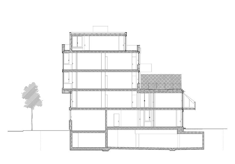
It’s tough. The building is part of a block where the existing buildings are all the same and form a continuous façade, and there’s a competition to design the other side of the block, so we will always be the only single building in this block. Because of that, but also because we face the slaughterhouse and the stadium, we needed a more monumental strong façade. However, since it’s a non-monumental programme we think the façade should be delicate with a fibre-cement façade with panels cast as plates with open joints. It’s a ventilated façade, and the fibre-cement panels are two centimetres thick, so it’s really thin, and the square pattern on the panels stand out, like rustication. The idea for the surface of the building is somewhere between these two examples; the Immeuble locatif à la porte Molitor in Paris by Le Corbusier, an urban building where Corbusier actually lived on the top floor, he had a kind of penthouse apartment, which is also next to a stadium by the way. We really admire the expression of this modernist masterpiece. How Corbusier managed to layer the building in a very simple yet complex order, with the development from below, up. And the other inspiration for us is the Palazzo Rucellai by Leon Battista Alberti. It’s basically the starting point of Renaissance architecture and has a very abstract, very designed, flat relief façade, which has an incredible tension, and has unlike other later Renaissance façades, no naturalism. In other words, every line is designed. We really like that this façade almost resembles a drawing. In the section you see the building is in movement. In the lower part, there’s a part projecting into the back of the site, and in the upper part there’s something projecting into the street space.
![]()
fig. 15
Herdernstrasse section
Zürich 2011
The back façade is much simpler.
![]()
fig. 16
Herdernstrasse model rear
Zürich 2011
It’s an outer insulation plaster façade, but then we try to make them look like plates that are placed in front of the structure by making an inverted corner, and it has this gap in-between, not to make it a massive bulky building but something that has flat surfaces. We like to think of this building as a modern building that has somehow thought of in a traditional sense, in a sense that the main street façade is more expensive, more ornate, and that the façade on the garden side is simpler and humble. In elevation and expression the building is more symmetrical, but then in plan the building is actually asymmetrical. The reason for the symmetry is only the dividing wall and the core, so therefore we tried to make a spatial arrangement that is freer and that unifies the whole building. We tried to think of the interior space of the building as an echo of the urban condition outside. Toward the street and the opening urban landscape the loadbearing pillars are somehow protecting or are parallel to the façade, while when you go into the depth of the building in the courtyard, the pillars don’t stand in the way, so there is a briefing of the interior plan in relationship to the urban situation. The pillars at the front also allow for a very beautiful view of the landscape because the window frame is hidden behind them. It’s similar to the impression you get at John Soane’s famous house in London where he added a bay window on to the existing building, maybe only a meter wide, and when you look from the main saloon through the bay window to the outside, the spatial edges of the bay windows cannot be seen. The plan oscillates between being a plan-libre, a flowing space, and a plan with defined spaces that can be closed off with doors. The intention is that every element has its own identity. You have the columns, the walls, kitchens and cupboards that are painted in different colours. You can go from the bathroom to the kitchen, and at the same time you can see through the whole building in that very private area of the apartment. There’s almost a separate situation that is inscribed into the main space of the apartment. You can walk through the whole apartment along the façade.
![]()
fig. 17
Herdernstrasse plan
Zürich 2011
It’s about spatially opening the restraints of a normal apartment plan, but still providing privacy.
OL
This is the last project we’re going to show. It’s an object for an exhibition about density called 2048. The object is figural but abstract. Its grid embodies openness and infinity, and yet it’s not aligned, it’s defined by planes.
![]()
fig. 18
Monument 2046
2012
The volumetric operation to create this was fairly simple and yet it looks different from every side.
SAMUEL PENN
Thank you both. Neil, you look like you have an urgent question.
NEIL GILLESPIE
That was an incredibly elegant presentation. Your Siza quote about the ugly plan fascinated me. I’m going to stray off the subject here, we’ve just got a kitten in our household at home, and I thought your presentation was very cat like and elegant, and this is where the kitten comes in. It was the Hejduk cat that made me think of this. The kitten that we’ve got is capable of the most elegant movement and then she’ll do the most amazing turn, which is not elegant but there’s something about it that is incredibly beguiling, it draws you in, you almost laugh out loud. But she can only do that because she’s capable of this very elegant movement. You can see that when she walks along the edge of a table. I thought your presentation was a bit like that walk along the edge of the table, and so I’m really interested in the notion that you’re attracted to an ugly plan, and I wonder if ugly is the right word, because I’m attracted to this view of complexity or the fact that Venturi’s buildings aren’t the most beautiful buildings, but there’s something about them that’s intriguing. I just wonder if you could say a little bit more about what you mean when you say an ugly plan, because your plans are incredibly attractive.
TP
We both worked for Roger Diener in Basel and he became famous for his capacity to draw very simple plans and very simple buildings where the structure of the plan would create an incredible unity with the bodily quality of the building. And then he would do urban designs that would continue somehow and arrange these very coherent buildings into urban situations. Our work is somehow a break from this because we realised that we have so many different ways of thinking about life today, so the idea of a coherent typology of an apartment that has value to all is impossible today. We find that there is no stability in the building plan anymore, a stability that in former times would create a type and even entire cities, where urbanism, building plans and façades would be one. We see an incredible fracture between those, which is maybe a result of the independent search between the plan, the façade, the urban plan and how they still have to come together and relate. This is where we see the cracks in the idea of unity in architecture. We don’t believe in the Gesamtkunstwerk, in the total piece of art. It has something to do with that.
OL
It’s also about having a contradictory openness in the project. You want a lot of things at the same time, and you work on all of these things at the same time, and that’s why, yes, in the end it looks a bit messy, but it has these spatial or facial qualities that we’re looking for. But it’s a constant balancing act and also keeping it a bit open.
TP
It has to do with the hermetic qualities that we don’t like in buildings. There are architects that admire when construction and expression become one, but we think that given the constraints it’s firstly impossible for us to achieve, but we also don’t think it’s an expression of how we feel culturally about building. We wouldn’t like to build a building and draw every piece of furniture, the tablecloth, the curtains, the silverware, we wouldn’t like that, I don’t think anyone in our age could do it, I mean seriously do it successfully.
SP
Are there any questions from the audience?
AUDIENCE
Yes, you say that you’re not interested in designing the furniture or the kettles or attempting to personalise the design for everybody because it’s not possible, and yet you seem comfortable to add a certain level of decoration that has a very strong stylistic attitude toward a building that you can’t ignore. Could you talk a little about that? You seem quite prepared to provide a style for the building that the person then moving into it has to adopt.
OL
With the first house it was private clients so it was a conversation with them. It depends on the client. I mean if you look at Tony Fretton’s Red House where everything is designed, and it’s a fantastic house, and you don’t feel like it’s hermetic in a way. I say that because it’s a contemporary piece, but also with Adolf Loos houses of course, everything is designed and it doesn’t feel hermetic.
TP
But I think there’s another point to it. I think what you’re saying is very true of past attitudes, at a time when most people would completely decorate their house as a living environment they somehow needed a certain degree of neutrality as a backdrop. Today people live with fewer and fewer belongings, less furniture, and with this the question of neutrality becomes really tricky, because it can be emptiness, or the lack of affection and feeling, instead of being neutral. I think it has a lot to do with the changes in how we like to furnish our living environment.
OL
There’s a lot of housing being built in Switzerland at the moment, that’s why young architects like us get to win competitions and build them. But most architects focus on the apartment plans themselves and don’t think about the façade or the urban situation. So there’s an incredible neutrality in the apartments being produced, cheap parquet floors, white wall and white kitchens, and that’s it, and the windows always basically look the same as well, and we try to fight against that neutrality, first by being specific about the site and about the character of the building, but then also for instance with these pillars we try to add at least one element that isn’t so neutral, which is a piece that is always there and which adds character to the apartments.
TP
I think architecture is a strange thing. The taste, the lifestyle and the spirit of the time can change, but we can still inhabit good spaces happily. Architecture is strange; it can be adapted, reused and cherished in different and sometimes unpredictable ways.
AUDIENCE
You pick very specific colour schemes for your buildings, but once you hand it over to the owners then these things will change. How do you feel about that?
TP
Very good—laughs! There’s a text by Rafael Moneo, which I think begins with ‘the loneliness of the buildings’, and that’s exactly about that, when the architect leaves, all the ideas, all the concepts, all the explanations are gone. It’s then just something to see, to use, it’s part of the city, and it’s part of culture. And when it changes sometimes it’s sad, but actually we don’t care. It’s a moment of liberty. I mean of course we still show our buildings and talk about them, but for us the Rüschlikon house for instance is very far away, and we’re just finishing this other building, which I’m sure we won’t want to see or think about in six months. Of course we hope that people enjoy what we’ve made, that they enjoy living in it.
OL
Everything that has been changed before the building is completed, or that gets out of control, or we disagree with is extremely painful for us. But once the building is completed, it’s okay. That’s human nature. We’re able to forget and move on.